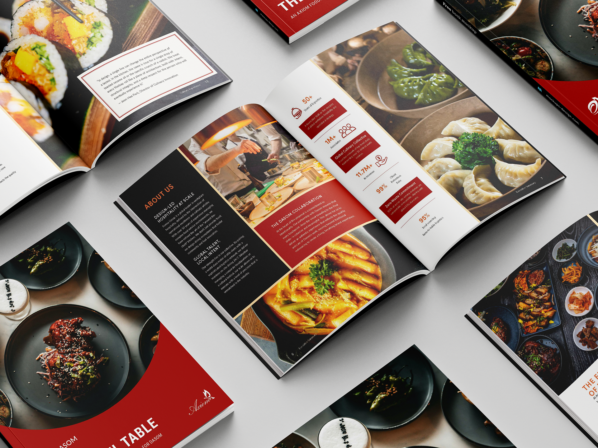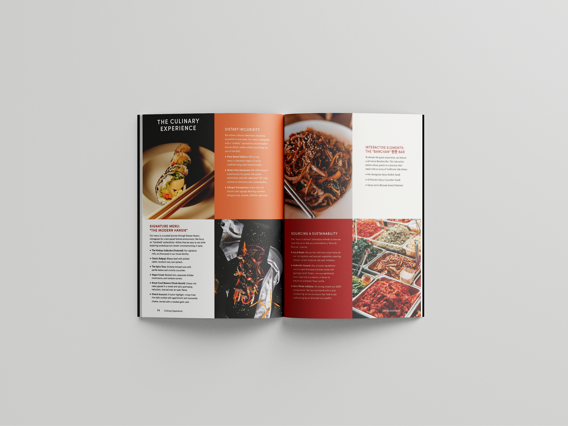

Dasom, a South Korean semiconductor technology company, sought to establish an on-site flagship café that authentically honored Korean heritage while serving a fast-paced, modern corporate audience. The existing foodservice footprint was cold, transactional, and lacked a sense of place.
The primary challenge was twofold:
Visual Alienation
Standard corporate foodservice branding felt generic and failed to connect with the company’s deeply held cultural values of heritage
and community.
Standard corporate foodservice branding felt generic and failed to connect with the company’s deeply held cultural values of heritage
and community.

The "Third Place" Gap
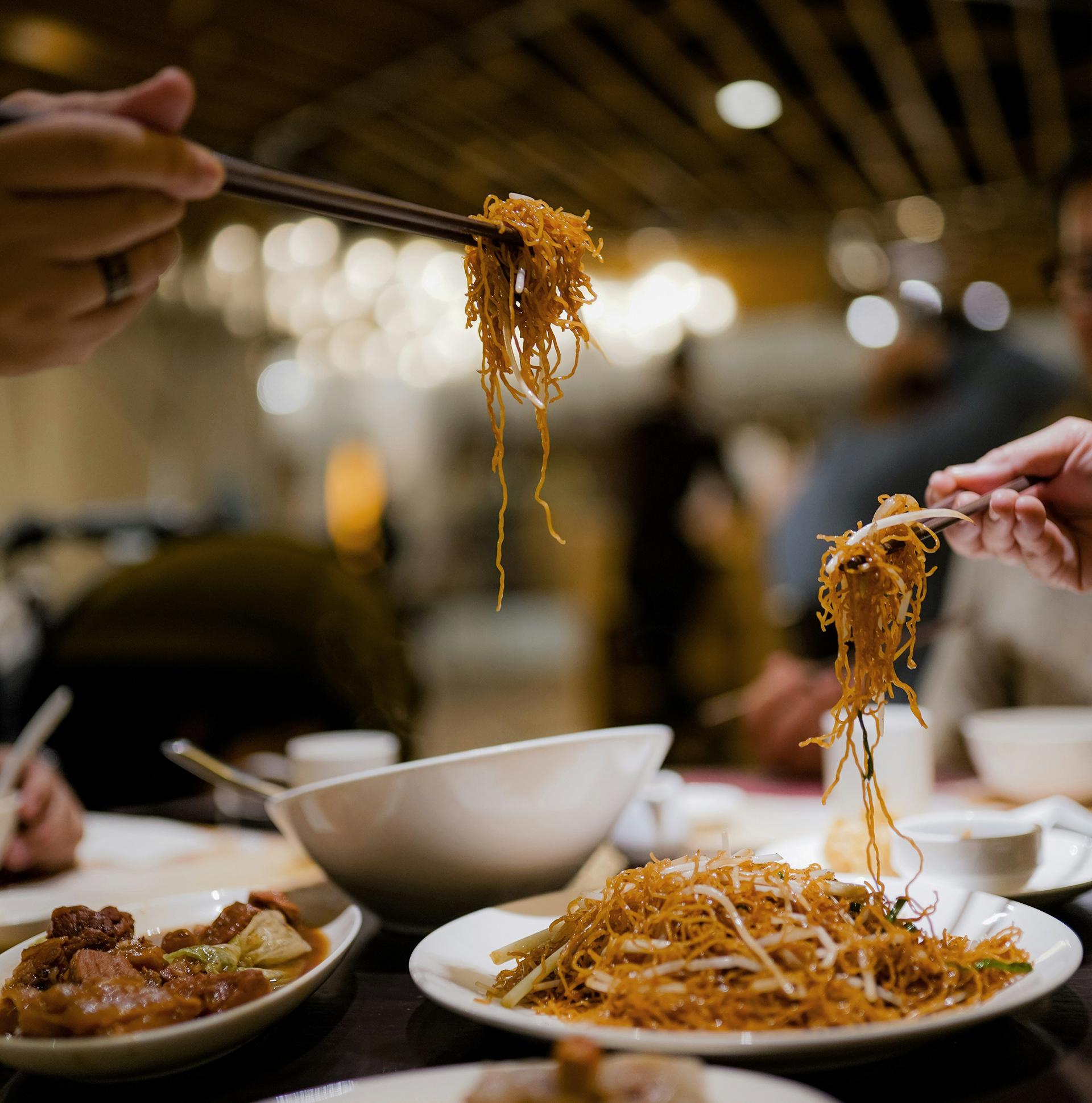
Employees lacked an inviting space that fostered Uri (우리), the Korean concept of communal family and togetherness, which directly impacted workplace community and collaboration.
Employees lacked an inviting space that fostered Uri (우리), the Korean concept of communal family and togetherness, which directly impacted workplace community and collaboration.
The Solution: A Heritage-Driven Brand Ecosystem
In the solution section, connect your visual design choices directly back to solving those business and cultural problems. This is where
you prove that your typography, layout, and
color palettes have a strategic purpose.
you prove that your typography, layout, and
color palettes have a strategic purpose.
The Visual Strategy
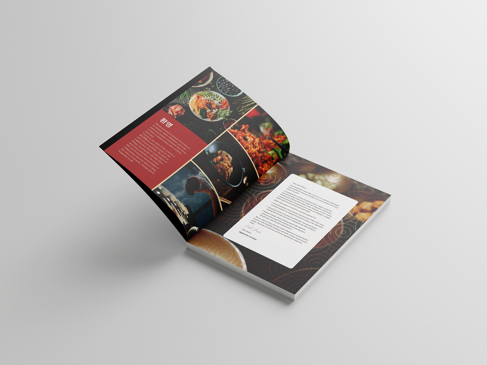
We developed a comprehensive B2B brand ecosystem that translated abstract heritage concepts into a tangible, modern hospitality experience. The design system bridged the
gap between traditional craftsmanship and contemporary functional minimalism.
gap between traditional craftsmanship and contemporary functional minimalism.
Visualizing Uri (Community): Engineered the spatial graphics, wayfinding, and touchpoints
to feel warm and inclusive, transforming a corporate asset into a community anchor.
to feel warm and inclusive, transforming a corporate asset into a community anchor.
Heritage-Rooted Identity: Developed a typographic system and palette inspired by natural elements (like Hanok timber and traditional ink tones) to subtly communicate authenticity without relying on clichés.
Scalable B2B Touchpoints: Designed everything from the core menu architecture and packaging systems to digital signage and uniform guidelines, ensuring a cohesive and premium brand rollout for the foodservice operations.